What Font Is Instagram An In-Depth Typography Guide
Curious about what font is Instagram using? Uncover the official logo, app, and Stories fonts, plus discover alternatives for your own brand's content.
So, you want to know what font Instagram uses? The truth is, there isn't just one. The app's visual identity is a clever mix of different typefaces, each with a specific job to do.
For its main branding, Instagram uses a custom-designed font called Instagram Sans. But the everyday text you see in your feed? That’s actually your phone's default font—San Francisco on iPhones and Roboto on Android devices.
A Multi-Font Strategy for Branding and Usability
Instead of sticking to a single typeface, Instagram uses a strategic system that balances a unique brand personality with a seamless user experience. It’s a great example of how to look good in marketing materials while making sure the app itself feels fast, familiar, and easy to read.
This approach splits the app's visual identity between its public-facing brand and the functional in-app experience.
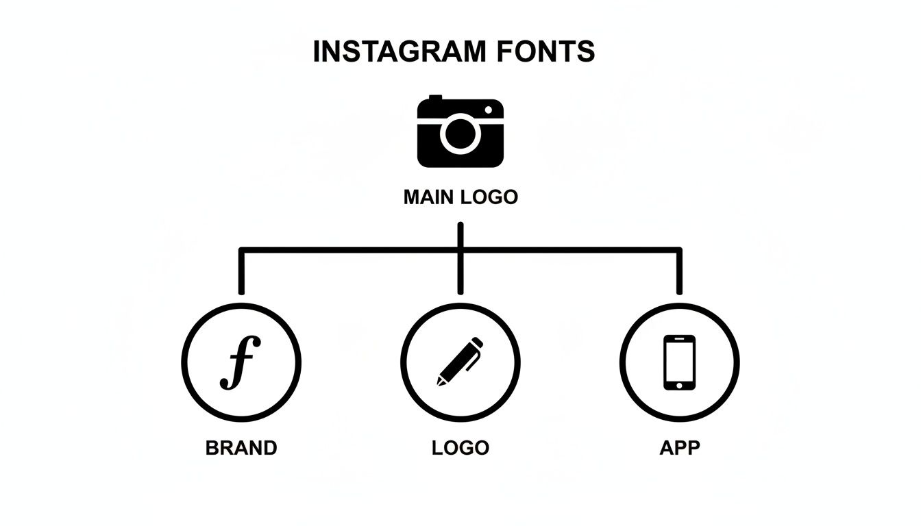
Here’s a quick rundown of the main players in Instagram's font lineup:
- For Branding & Marketing: The star of the show is Instagram Sans. It's a custom font you'll see in ads and promotional materials, designed to echo the "squircle" shape of the app's logo.
- For the In-App Interface: To keep things running smoothly, the app defaults to your device's native system font. This ensures the app feels natural and performs well, no matter what phone you have.
- For the Original Logo: That classic, script-style logo that so many of us remember? That was based on the Billabong font, giving the brand its original, retro camera feel.
To make it even clearer, here's a quick summary of where each font shows up.
Instagram's Key Fonts at a Glance
| Usage Area | Font Name | Description |
|---|---|---|
| Current Branding | Instagram Sans | A custom sans-serif font used for all marketing and branding. |
| In-App (iOS) | San Francisco | The default system font for Apple devices, used for all UI text. |
| In-App (Android) | Roboto | The default system font for Android devices, used for all UI text. |
| Original Logo | Billabong | The script font that inspired the iconic, pre-2016 Instagram logo. |
This multi-font system is what allows Instagram to maintain a strong, recognizable brand voice while still feeling native and accessible to billions of users on different devices. Each font plays a specific, intentional role.
The Story Behind Instagram's Logo Font
Every iconic brand has a story, and a huge part of Instagram's early identity was wrapped up in its nostalgic, script-style logo. When the platform first launched back in 2010, its branding was built around the Billabong font, a playful, cursive typeface that perfectly captured the app's vintage, Polaroid-inspired vibe. That font choice instantly gave Instagram a friendly, retro feel that early users loved.
But Billabong's whimsical charm had some practical downsides. While it was stylish, the font wasn't always the easiest to read. Design critics pointed out that its casual look could come across as 'sloppy,' and users often mixed up the capital 'I' with a lowercase 'g.' These were minor annoyances at first, but they became real legibility problems as the platform started to grow.
A Custom Solution for a Growing Brand
Recognizing it needed a more refined and unique identity, Instagram decided to move away from off-the-shelf fonts in 2013. The company brought in designer Mackey Saturday to create a completely custom script for its wordmark.
This new lettering was a subtle but significant upgrade. It kept the fluid, handwritten charm of the original but was cleaner, more balanced, and distinctly Instagram's own. The redesign fixed the legibility issues and gave the brand a proprietary asset it could own entirely. It was a key step in Instagram's transition from a quirky startup to a more polished, professional platform.
"A brand’s logo is its signature. By creating a custom script, Instagram was no longer just using a font; it was crafting its own unique typographic identity."
The Minimalist Wordmark of Today
As Instagram's explosive growth continued, its visual identity evolved once again. The detailed, hand-drawn script was eventually retired in favor of the clean, minimalist wordmark we see today alongside the gradient logo.
This final shift mirrors Instagram's transformation into a global tech powerhouse. The simple, sans-serif wordmark is more versatile, scalable, and legible across countless devices and contexts. It aligns the brand with a modern, streamlined aesthetic—leaving its charming, retro past behind for a look that speaks to its current status as a pillar of digital communication.
Say Hello to Instagram Sans: The Platform's Custom Typeface
Back in 2022, Instagram decided it was time for a major visual overhaul and rolled out Instagram Sans, its very own custom typeface. This wasn't just a simple font swap; it was a move to give the brand a singular, recognizable voice across all its marketing and official communications. While you won't be using it to write your captions, you'll see it everywhere else—it’s the new typographic heart of Instagram.
Developed with the renowned Colophon Foundry, Instagram Sans pulls its inspiration directly from the brand’s most iconic visual cue: the "squircle" shape of the app logo. That unique blend of a circle's softness and a square's structure is baked right into the DNA of every letter. The result is a font that feels friendly and approachable, yet clean and geometric.
![]()
A Font Built for a Global Community
Instagram Sans is more than just a pretty face; it was engineered from the ground up for a worldwide audience. In May 2022, the company shared that a team of 40 typographers and language experts worked together to make the font legible and accessible across a huge range of global scripts.
This massive undertaking ensures the typeface works just as beautifully in languages like Arabic and Korean as it does in English. It's a clear nod to the platform's commitment to its 2 billion+ monthly users around the globe. You can read more about the design process and see how it reflects their brand evolution.
Instagram Sans gives the brand a flexible typographic toolkit. By using a single font family, the company ensures its visual identity remains cohesive, whether you see it in a billboard ad or a small in-app notification.
To handle any situation, the font family comes equipped with several distinct styles, giving designers a versatile toolkit.
- Instagram Sans Regular: The reliable workhorse of the family, perfect for everyday body text and general communications.
- Instagram Sans Headline: A punchier, more expressive style built for high-impact titles and marketing that needs to grab attention.
- Instagram Sans Condensed: A space-saving version designed for tight layouts where every pixel counts, without losing readability.
With other weights like Light, Medium, and even a few Script variations in the mix, Instagram Sans has everything the brand needs to speak with a clear, consistent voice—no matter where in the world you're scrolling from.
The Everyday Fonts You See in Your Feed
Ever wonder what font Instagram uses for all the text in your feed—the captions, comments, and bios? It’s a surprisingly straightforward answer: the app doesn't use a special, custom-built font for its interface. Instead, Instagram cleverly defaults to your phone’s own native system font.
This is a really practical move for a global app. By piggybacking on the fonts already built into your device, Instagram makes sure the app feels familiar, loads fast, and just plain works, no matter what phone you're using. It’s a lot like how a web browser uses the fonts on your computer to display a website without a hitch.
System Fonts for a Seamless Experience
This approach means the font you see is entirely dependent on your phone’s operating system. If you’re scrolling on an Apple device, all the text is rendered in San Francisco, Apple’s proprietary system font. On the flip side, if you're on an Android, you're looking at Google’s workhorse font, Roboto.
This strategy is all about accessibility and performance.
- It guarantees readability across billions of different screens.
- It supports native accessibility features, like dynamic text resizing for users with visual impairments.
- It keeps the app light and simple, since there's no need to load and manage a heavy custom font file just for the interface.
Today, Instagram’s in-app interface uses system fonts—San Francisco for iOS and Roboto for Android—while reserving its custom Instagram Sans exclusively for branding and marketing. This multi-font strategy shows how platforms balance brand identity with technical needs. Discover more insights about this sophisticated approach to typography on yellopolitics.com.
Ultimately, this creates a clean separation between the brand font (Instagram Sans) and the UI font (San Francisco or Roboto). While Instagram Sans shapes the brand's personality in ads and marketing, your phone’s system font is what makes sure the app itself runs smoothly. If you're looking to get a little more creative with your bio, you might also be interested in our guide on using a small text generator to create some unique styles.
Decoding the Different Fonts in Instagram Stories
Instagram Stories is a creative playground, and typography is one of the starring roles in grabbing your audience's attention. Unlike the rest of the app's interface, Stories gives you a dedicated toolkit of nine distinct font styles, each with its own personality and purpose. This curated selection lets you move beyond standard text and infuse your content with a specific mood or message.
Think of these fonts like actors in a play—each one is suited for a different role. Some are bold and loud, perfect for making a big announcement. Others are subtle and elegant, ideal for a more personal touch. Knowing which font works best for each scenario is key to effective visual storytelling.
Exploring the Story Font Styles
The nine fonts available give you a surprisingly versatile range of options to match your content's tone. Choosing the right one can make the difference between a Story that gets tapped through and one that truly connects with your viewers.
Here's a quick breakdown of the primary styles you'll find:
- Modern (Sans-Serif): This is your clean, default option. It’s highly legible and works for almost any situation, from simple captions to more informative text.
- Classic (Typewriter): With its monospaced, retro feel, this font is great for a vintage aesthetic, weaving a longer narrative, or adding a touch of classic literary flair.
- Neon (Script): This glowing script font mimics a bright neon sign. It's perfect for party announcements, energetic quotes, or anything that needs a vibrant, electric look.
- Strong (Bold Sans-Serif): When you need your message to hit hard, this is the font to use. Its thick, blocky letters are ideal for powerful headlines and unmissable calls-to-action.
Mastering these styles helps your content stand out in a crowded feed. If you're looking for even more ways to stylize your text, check out how a glitch text generator can create eye-catching effects for your other social media posts.
Get the Instagram Font Look for Your Content
Let's be honest, capturing that clean, modern Instagram aesthetic in your own content is a smart move for brand consistency. But here's the catch: the official Instagram Sans typeface is proprietary. You can't just download and use it.
The good news? You can get incredibly close to that same look and feel using high-quality, widely accessible alternatives. This way, you can echo the platform’s signature style without stepping on any legal toes.
Fonts like Neue Helvetica or Freight Sans, for example, have a similar geometric and friendly vibe. They nail that same excellent readability and modern simplicity, making them fantastic stand-ins for creating Instagram-style graphics.
Find Your Own Unique Style
Another way to stand out is by using unique text styles right in your bio and captions. While you can't upload your own fonts to the app, you can use special Unicode characters to create stylized text that grabs attention. This is where a font generator becomes your best friend.
It's a pretty straightforward process:
- Type Your Text: Pop the word or phrase you want to style into the generator.
- Choose a Style: Browse through a list of creative options until you find one you like.
- Copy and Paste: Just click to copy the new text and paste it directly into your Instagram bio, captions, or comments.
This is such a simple way to build a distinct and memorable profile. It adds a layer of personality that helps your content pop in a visually crowded feed, making your brand more recognizable at a glance.
By pairing classic font alternatives in your designs with stylized text in your profile, you create a look that's both cohesive and professional. If you want to play around with different effects, you can learn more about using an italics generator to add extra emphasis where you need it.
A Few Common Questions About Instagram's Fonts
Diving into the world of Instagram's typography usually brings up a few questions. Let's clear up some of the most common ones people ask when they're trying to pin down exactly what fonts Instagram uses and how it all works.
Can I Download the Official Instagram Sans Font?
Unfortunately, no. Instagram Sans is a proprietary font created just for Meta, so it isn't available for public download or use. The company keeps it exclusively for its own branding and marketing materials.
If you're trying to capture that clean, modern vibe, you can get a very similar look with high-quality alternatives like Neue Helvetica.
Why Does Instagram Look Different on My iPhone vs. My Friend's Android?
This is a great question, and the answer is pretty simple: Instagram uses the native "system font" of whatever device you're on.
So, if you're scrolling on an iPhone, the app's interface text is displayed in Apple’s own San Francisco font. But if your friend is on an Android, they're seeing Google’s Roboto font. They're designed to look similar, but those subtle differences are why the app's text can feel slightly different from one phone to the next.
Ready to make your own text stand out? The MakerSilo toolkit helps you generate unique font styles, symbols, and memes in seconds. Start creating for free on makersilo.com.